Why SAP real estate reporting becomes a reconstruction exercise
Imagine a monthly portfolio review.
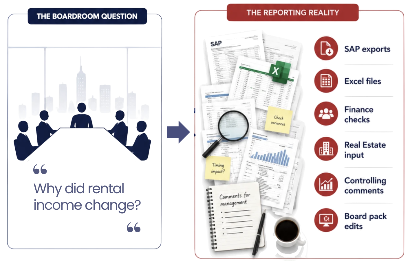
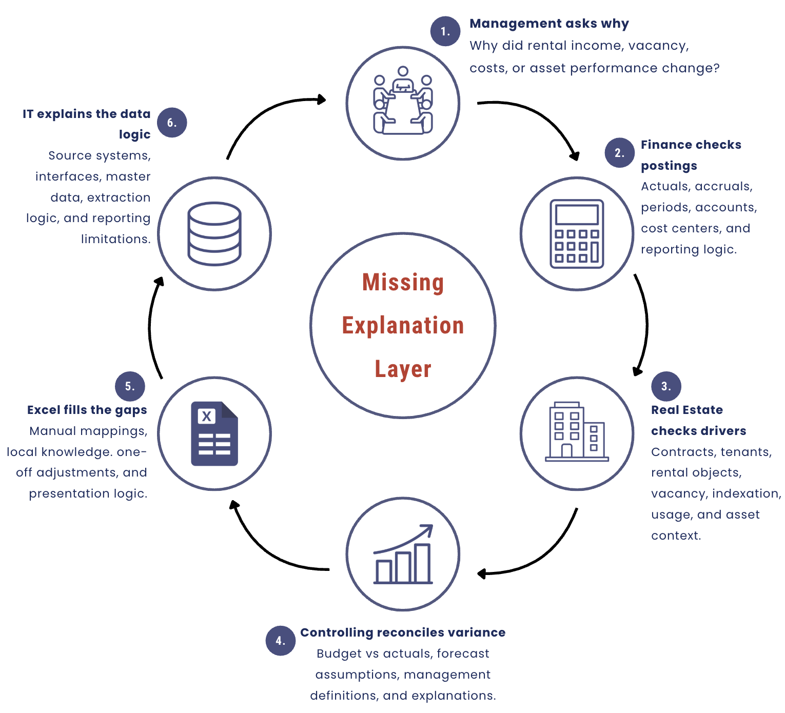
Rental income is below budget. The board asks a simple question: why?
At first, it sounds like a normal reporting question. Someone should be able to open the report, drill into the number, and explain what happened. But that is not how the process usually works in many SAP-driven real estate organizations.
Finance checks the posted revenue accounts. Real Estate looks at contracts, tenants, vacancies, and indexation. Controlling compares the result against budget assumptions. Someone opens an Excel file to check a manual mapping. IT is asked whether the latest extract includes the right objects, periods, and master data. After several conversations, the team eventually produces an explanation.
The answer may be correct. It may even be accepted by management. But the path to the answer reveals the real problem.
The organization did not simply report performance. It reconstructed the performance story.
This is one of the most important hidden problems in real estate reporting. The issue is rarely that the organization has no data. In most cases, the data is already there. It may exist in SAP RE-FX, S/4HANA, BW, SAP Analytics Cloud, Excel planning files, asset management files, maintenance records, or external ESG and market data.
The deeper issue is that the explanation is not yet modelled.
The organization has transactions. It has reports. It may have dashboards. But when management asks why something changed, the answer still has to be assembled from systems, spreadsheets, people, and assumptions.
That is why the better question is not, “Do we have a dashboard?”
The better question is this:
How much of our real estate reporting is analysis, and how much is reconstruction?
The reporting process can look mature and still be fragile
A monthly real estate report can look professional from the outside. It may have clean charts, familiar KPIs, board-ready formatting, and consistent delivery dates. But underneath the surface, it may depend on a fragile chain of expert knowledge.
One person knows which SAP export to use. Another person knows which contracts changed. Someone in Finance understands why the posting period does not match the operational event. A controller knows which budget assumption was used. An asset manager remembers that a vacancy was planned, not unexpected. Someone else knows which Excel adjustment should not be overwritten.
This is not unusual. It is how many reporting processes evolve. They begin with a genuine business need, then grow around available data, local workarounds, reporting deadlines, and the knowledge of experienced people. Over time, the process works, but it becomes dependent on manual reconstruction.
The risk is that the organization starts confusing report production with reporting maturity.
A report can be produced every month and still be difficult to trust, explain, reuse, or scale. The board pack may arrive on time, but if every important question requires several people to rebuild the logic behind the number, then the organization does not have a true explanation layer. It has a recurring investigation process.
That distinction matters because the real cost is not only time. The bigger cost is decision confidence.
When the path from KPI to explanation is unclear, management has to trust the people behind the report rather than the reporting model itself. That may work when the same experts are available, but it becomes fragile when the portfolio grows, the reporting requirements change, or the organization wants more frequent and more detailed insight.
Why the question “why did rental income change?” is harder than it sounds
Rental income is a good example because it looks simple at board level. It is usually presented as one number, perhaps with a variance against budget or previous year. But behind that number sits a complex chain of commercial, operational, and financial logic.
A change in rental income may come from vacancy. It may come from a contract expiry, a tenant change, a delayed contract start, indexation, a condition adjustment, a billing timing issue, an accrual, a posting correction, or a difference between budget assumptions and actual contract terms.
Each of these drivers may live in a different part of the organization’s reporting landscape.
SAP RE-FX may contain the contract conditions, rental objects, business partners, validity periods, and vacancy logic. S/4HANA may contain the financial postings, accounts, periods, accruals, and actuals. Planning data may sit in SAP Analytics Cloud, BW, or Excel. Portfolio structures may depend on hierarchies that are not always designed for management reporting. Local explanations may sit in emails, comments, or the knowledge of asset managers.
So when management asks why rental income changed, the organization is not answering one question. It is connecting several layers of meaning.
It needs to understand the commercial driver, the financial impact, the portfolio location, the planning assumption, and the source of truth. If those layers are not already connected in the reporting model, the explanation has to be reconstructed manually.
This is why many real estate reporting problems are not really visualization problems. They are modelling problems.
A chart can show that rental income moved. The model explains why it moved.
The chart shows the KPI. The model explains the KPI.
This is the key distinction.
A dashboard can show that rental income decreased. But the reporting model should help explain whether the decrease came from vacancy, tenant mix, contract changes, indexation, billing timing, or financial postings.
A dashboard can show that costs increased. But the model should help explain whether the increase sits in one asset, one cost category, one supplier, one period, one maintenance event, or one planning assumption.
A dashboard can show that one asset is underperforming. But the model should help distinguish between structural underperformance and temporary noise caused by timing, renovation, vacancy, maintenance, or a one-off effect.
This is where many reporting initiatives lose value. They focus on the visible dashboard before they have clarified the explanation logic behind it.
The question should not be only, “Which chart should we build?”
It should be, “Which management question must this model be able to explain?”
That changes the entire approach. Instead of building a report around available fields, the organization designs a reporting layer around the decisions it needs to support.
The five layers behind a useful real estate explanation
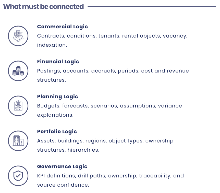
To move from reconstruction to explanation, a real estate reporting model needs to connect several types of logic. These layers do not need to be complicated for the user, but they do need to exist behind the scenes.
The first layer is commercial logic. This is the real estate business view. It includes contracts, tenants, rental objects, condition types, vacancy, indexation, usage, and contract expiries. Without this layer, rental income becomes an accounting result without a clear commercial explanation. Management may see that income changed, but not whether the movement was caused by vacancy, renegotiation, tenant churn, indexation, or contract timing.
The second layer is financial logic. This is the accounting and controlling view. It includes postings, accounts, cost centers, accruals, periods, actuals, budgets, and cost or revenue structures. Without this layer, Real Estate may have a commercially correct explanation that Finance cannot reconcile. This is where reporting friction often appears. One team speaks in contracts and objects. Another speaks in accounts and periods. Both may be right, but the reporting model has to connect the two views.
The third layer is planning logic. This is the forward-looking view. It includes budgets, forecasts, scenarios, assumptions, planned vacancy, expected rental changes, maintenance plans, CAPEX, and cost inflation. Without this layer, variance reporting becomes commentary after the fact. The organization can describe what happened, but it struggles to learn from the variance or update its view of the future.
The fourth layer is portfolio logic. This is the management view of the real estate portfolio. It includes assets, buildings, regions, object types, ownership structures, asset classes, and portfolio hierarchies. Without this layer, management sees totals but cannot easily identify where decisions should be made. The value of a KPI increases when users can move from portfolio level to the asset, building, region, tenant, or object type that explains the movement.
The fifth layer is governance logic. This is the trust layer. It includes KPI definitions, data ownership, calculation rules, transformation logic, drill paths, source traceability, and confidence in the source. Without governance logic, even correct dashboards remain politically fragile. Every number can be challenged because the organization cannot easily answer where it came from, how it was calculated, who owns the definition, and whether Finance and Real Estate interpret it the same way.
When these layers are not connected, the organization still needs people to connect them manually. That is the reconstruction exercise.
Excel is often the symptom, not the disease
Many organizations describe this as an Excel problem. They say there are too many spreadsheets, too many versions, too many manual adjustments, and too many reconciliations.
That may be true, but Excel is often not the root cause. Excel is usually where missing business logic goes to survive.
If the system does not connect contracts to financial postings, someone builds a workbook. If the portfolio hierarchy is not available in the reporting model, someone maintains a mapping file. If planning assumptions do not connect to actuals, someone creates a bridge manually. If the dashboard cannot explain the variance, someone adds commentary in Excel or PowerPoint.
In this way, Excel becomes the unofficial explanation layer.
That is why simply replacing Excel with a dashboard rarely solves the real problem. If the new dashboard does not contain the business logic that Excel was holding, users will continue to export, adjust, reconcile, and explain outside the system.
The goal is not to eliminate Excel everywhere. Excel can still be useful for exploration, ad hoc analysis, and local modelling. The goal is to stop using Excel as the hidden backbone of recurring management reporting.
A better reporting architecture gives recurring business logic a governed home. It makes the explanation repeatable, traceable, and shared.
The same problem looks different depending on where you sit
One reason this issue is hard to solve is that each team experiences it differently.
For the CFO, it is a trust problem. The board pack needs to be reliable, explainable, and consistent. If numbers change but the explanation requires a manual investigation, confidence is weakened.
For the Head of Real Estate, it is an explanation problem. Portfolio performance cannot be managed only through accounting outcomes. It needs to be understood through contracts, tenants, vacancy, asset quality, cost drivers, and operational context.
For Controlling, it is a workload problem. Every month, the team has to connect actuals, budgets, forecasts, assumptions, comments, and variance logic. The work is valuable, but too much of it is spent assembling the explanation rather than interpreting it.
For IT and data teams, it is an architecture problem. Business-critical logic may be spread across SAP, spreadsheets, interfaces, manual mappings, and local files. The more this grows, the harder it becomes to govern, scale, or improve.
These are not separate problems. They are different views of the same gap.
The organization lacks a shared explanation layer.
A good reporting model does not remove the different perspectives of Finance, Real Estate, Controlling, and IT. It connects them so that the same KPI can be understood financially, commercially, operationally, and managerially.
Five signs your reporting is really reconstruction
A useful way to evaluate your current reporting process is to look for the signs of reconstruction.
The first sign is that every important number has a person behind it. If the organization relies on specific individuals to explain how a KPI was assembled, the process may be more expert-dependent than model-driven.
The second sign is that Excel is used for recurring business logic, not just analysis. When mappings, adjustments, assumptions, and commentary live in spreadsheets, Excel has become part of the reporting architecture whether the organization officially recognizes it or not.
The third sign is that Finance and Real Estate both trust their own view, but not always each other’s explanation. This usually means the reporting model does not bridge financial and operational logic clearly enough.
The fourth sign is that drill-down stops before the real explanation begins. A dashboard may allow users to filter by region or asset, but if the user still needs to leave the report to understand contracts, postings, vacancy, or planning assumptions, the explanation layer is incomplete.
The fifth sign is that the same questions come back every month. If management repeatedly asks why a number moved and the team repeatedly rebuilds the story, the organization is not learning through its reporting process. It is repeating a manual investigation cycle.
These signs do not mean the reporting team is doing poor work. Usually, the opposite is true. They often mean the team is compensating for a reporting model that has not yet been designed around the real management questions.
Why this insight matters
Seeing the problem clearly changes the solution.
If you think the problem is dashboard design, you ask for better charts. If you think the problem is Excel, you ask people to stop using spreadsheets. If you think the problem is extraction, you ask IT for another interface.
But if you understand the problem as missing explanation logic, you ask better questions.
Which management questions must the model answer? Which business logic currently lives in people’s heads or Excel files? Which KPI definitions are disputed? Which drill paths are needed? Which source systems carry the commercial, financial, planning, and portfolio truth? Which explanations are repeated every month and should therefore be modelled?
This is the value of the reconstruction insight. It helps the organization stop treating symptoms and start designing the reporting layer around the real work management is trying to do.
The goal is not simply to produce a faster report. The goal is to create a more confident management conversation.
What good looks like
A better real estate reporting layer starts with the questions management actually asks.
When rental income changes, the user should be able to move from the portfolio number to the driver behind the movement. The explanation should show whether the change is linked to vacancy, contracts, tenants, indexation, timing, budget assumptions, or financial postings.
When vacancy increases, the reporting should not stop at a percentage. It should help management understand the income exposure, duration, asset context, and portfolio priority.
When costs exceed budget, the user should be able to see whether the variance is driven by an asset, cost type, period, supplier, maintenance event, or planning assumption.
When an asset underperforms, the reporting should help distinguish between temporary noise and structural weakness.
This does not remove the need for human judgment. Real estate performance still requires interpretation. But a good reporting layer reduces the manual work needed before interpretation can begin.
That is the shift from reporting as production to reporting as explanation.
The role of SAP Analytics Cloud
For SAP-driven real estate organizations, SAP Analytics Cloud can be a strong platform for this shift. But it is important to be precise about where the value comes from.
SAC is not a shortcut around modelling. It becomes valuable when the model behind it connects the right business logic.
The real value is not only in visualizing SAP RE-FX or S/4HANA data. The value is in connecting contracts, objects, tenants, vacancy, financial postings, planning assumptions, portfolio hierarchies, and KPI definitions into a reporting experience that reflects how management asks questions.
That is why the first step should not be choosing charts. The first step should be diagnosing where the explanation breaks today.
Once that is clear, the dashboard design becomes much more powerful. The story can be built around the questions that matter: portfolio performance, rental income, vacancy, ancillary costs, OPEX, budget versus actuals, maintenance, CAPEX, ESG, and asset-level drill-down.
A good SAC story is not just a visualization. It is a structured management conversation built on trusted business logic.
A practical starting point
Choose one KPI from your real estate board report.
Rental income is often a good candidate. Vacancy, OPEX, ancillary costs, maintenance, and budget variance are also useful.
Then ask one question:
Can we explain this KPI from board level down to the operational and financial drivers without manually rebuilding the story?
If the answer is no, examine where the explanation breaks. Does it break when connecting contracts to postings? Does it break when comparing actuals to budget? Does it break when moving from portfolio level to asset level? Does it break because Finance and Real Estate define the KPI differently? Does it break because the business logic lives in Excel? Does it break because the source can be traced technically but not understood managerially?
This exercise is simple, but it is revealing. It shows whether the organization has a reporting output or an explanation model.
From reconstruction to explanation
For many SAP-driven real estate organizations, the opportunity is not to start from zero. The data may already exist. The expertise may already exist. The reports may already exist.
The opportunity is to connect them differently.
Instead of asking experts to rebuild the performance story every month, the organization can create a governed reporting layer that brings commercial, financial, planning, portfolio, and governance logic together.
That is what turns reporting from a monthly reconstruction exercise into a reusable explanation system.
The future of real estate reporting is not more manual investigation. It is governed explanation.
Because when the board asks why, the organization should not have to start from scratch.
It should already have a model that helps explain the answer.
See what your SAP real estate data could already explain
Conactive’s SAP Analytics Cloud Real Estate Reporting Showcase demonstrates how SAP-centered real estate teams can move from manual reporting reconstruction to management-ready insight.
The showcase includes examples for portfolio KPIs, rental income and contracts, vacancy and occupancy, ancillary costs and OPEX, asset-level drill-down, maintenance, ESG, and future planning.
If your current reporting process still depends on SAP exports, Excel files, manual reconciliation, and cross-team explanations, a short diagnostic can help identify where the explanation layer is missing.
Explore our Real Estate reporting showcase using SAP Analytics Cloud under our Showcases tab.
Book a 60-minute Reporting Reconstruction Diagnostic to identify which management questions your current setup cannot answer cleanly today and what a better explanation layer could look like on top of SAP RE-FX, S/4HANA, SAP Analytics Cloud, Excel, or related data sources.
Continue the conversation with the author

Daniel Leal
Data & AI Infrastructure Consultant
Book a free 30-min call with Daniel and leave with clarity on your next step.
Pick your time in 60 seconds
